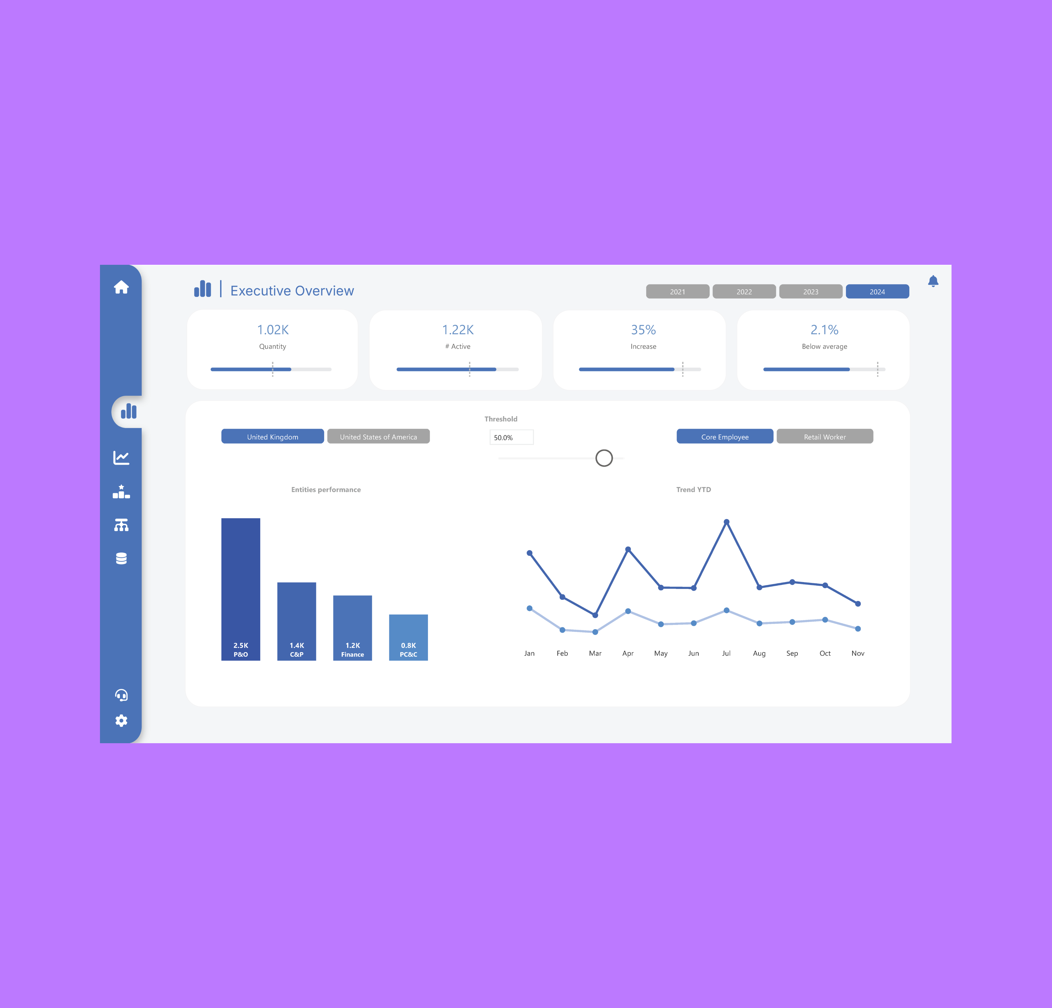
Overview
Data Experience Design is a practice I developed over several years of working at the intersection of BI, product and UX. The core belief: most enterprise BI tools are designed by engineers for engineers — powerful, but inaccessible, dense and slow to yield insight. Treating the report as a product changes everything.
The Approach
I applied UX research methods — user interviews, task analysis and heuristic evaluation — to understand how analysts and decision-makers actually use reports. The findings were consistent: users scan, not read; they look for anomalies, not averages; and they lose trust in data when the design is cluttered or inconsistent.
From these insights, I developed a set of design principles for BI: visual hierarchy that matches the decision workflow, narrative structure that separates signal from noise, and component-based consistency that builds familiarity and trust over time.
Outcome
A clear visual hierarchy, guided narrative structure and a component-based design that separates signal from noise — helping stakeholders reach insight faster and with higher confidence. This approach fed directly into the Reporting Design System project.
Principles Developed
- Visual hierarchy aligned to the decision workflow, not the data structure
- Narrative-led layouts that guide the eye from summary to detail
- Component consistency that builds familiarity and trust over time
- Accessibility-first colour and type choices across all reporting surfaces