Overview
As Product Manager for Fleet & B2B Pricing at bp Global Pricing (2024–2025), I led a 12-month initiative covering Fleet Europe's reporting landscape — 15+ active reports across multiple markets and user groups. The team spanned one product designer, three BI developers and two data engineers, with stakeholders across six European markets.
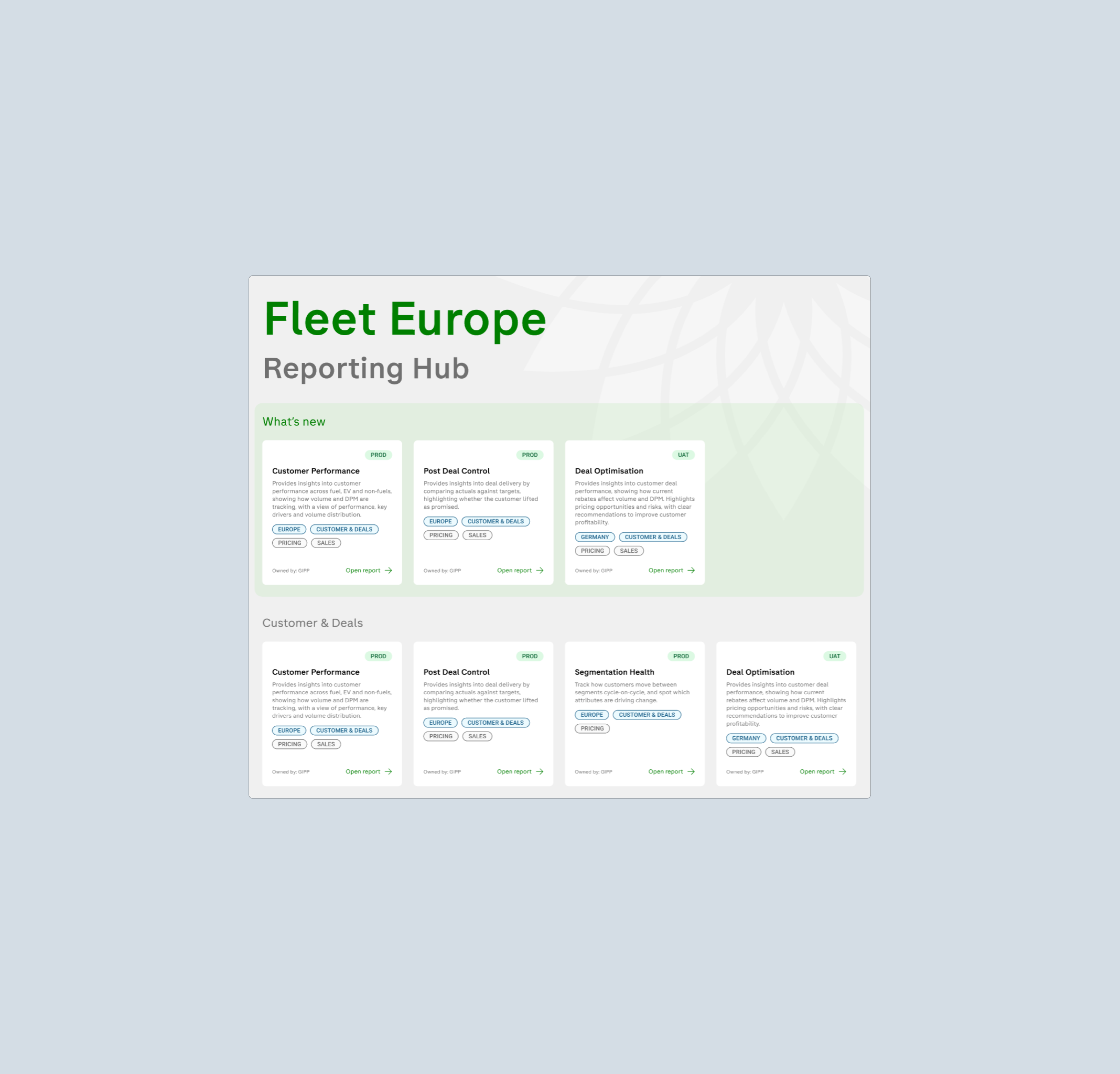
The core idea: treat reporting as a product, not a technical deliverable. The output was a six-stage Reporting Product Framework, a mirrored Figma ↔ Power BI design system, and a single landing hub bringing every report under one governed roof.
The Problem
An audit of the Fleet reporting landscape surfaced a textbook case of reporting built as a technical deliverable, not a product. Fifteen reports had been built by fifteen different people, each with their own layout, colour and navigation logic — no shared design system, brand guidelines or documentation.
There was no landing page, index or status information, so nobody could tell what already existed. A pricing lead was manually compiling market performance data from spreadsheets every week — unaware that a report already replaced that entire workflow. Reports had no defined owners or lifecycle either: when contractors left, so did the knowledge of how each report worked, and nobody knew who to call when something broke.
The moment that mattered: a report nobody knows exists has zero business value. Discoverability wasn't a communications problem — it was a product problem.
The Approach
Stakeholders hadn't asked for a reporting transformation — they'd asked for reports. So the case for change was framed in commercial terms: discoverability drives adoption, standards reduce future cost, and governance protects trust. It took roughly three months of sustained argument before the initiative had enough stakeholder support to proceed formally — the most important and least visible part of the transformation.
The result was the Reporting Product Framework: a six-stage lifecycle drawn from data-as-a-product and data mesh principles, where each stage gates the next and nothing moves forward without a defined deliverable.
1. Discovery & Strategy — why this report, who is it for
2. UX & Product Design — story, wireframes, review
3. Design System & Components — a Figma ↔ Power BI library
4. Development Standards — naming, measures, pipelines
5. App Deployment & Audience — managed apps, access, analytics
6. Testing, Validation & Sign-off — business, data, UAT, owner
Framework in Detail
Every report starts with a formal Reporting Strategy Document — audience, decisions supported, consumption pattern, and the action each page should drive. If a page doesn't lead to a decision, it doesn't get built.
Wireframes and high-fidelity designs follow sixteen dashboard principles: commercial outcomes first, macro-to-micro flow, alerts surfaced early, context always visible — reviewed with a real stakeholder before build.
A governed component library — charts, colour tokens, navigation, filters, KPI cards, alerts — is mirrored across Figma and Power BI, so any two reports feel like one product.
Scope of Work
- End-to-end PM ownership from discovery through to a six-stage governed framework
- Reporting Strategy Document template — audience, decisions supported, consumption pattern, page-level actions
- Sixteen dashboard design principles applied across 15+ active reports
- Governed component library mirrored across Figma and Power BI
- Centralised landing hub surfacing existing reporting investment
- Stakeholder alignment across six European markets over roughly three months
- Cross-functional delivery with a product designer, three BI developers and two data engineers
- Documentation in Confluence, backlog managed in Azure DevOps
Want the full picture? The case study below walks through the process, the decisions and the outcome in more detail.
View Case Study ↗